5 Amazon KDP Coloring Book MISTAKES! (Avoid These Profit-Killers)
Oct 11, 2025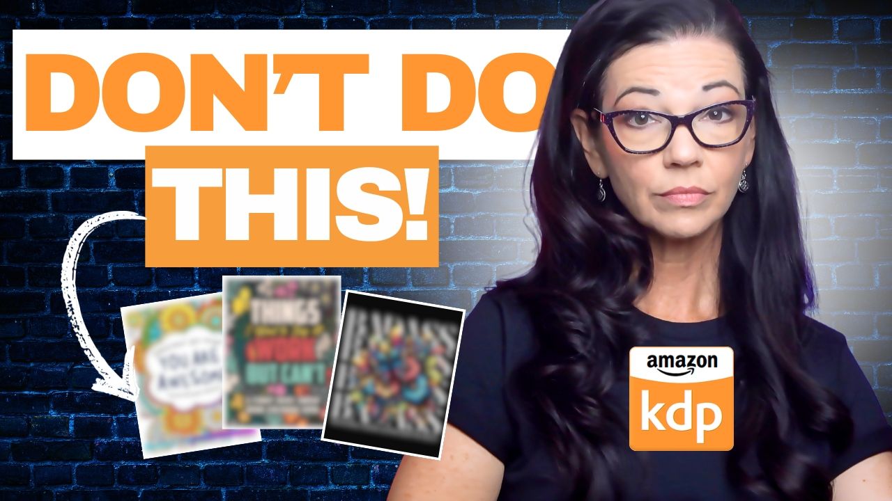
After working with hundreds of aspiring KDP authors, I've seen far too many make the same critical blunders that leave them with zero sales and a stack of forgotten projects. If you've poured hours into creating your coloring book, only to see it gather digital dust, then you need a clear intervention. I’m here to pull back the curtain on the five most common, profit-killing mistakes in the KDP coloring book niche. These are mistakes I’ve personally helped clients overcome to unlock significant sales. My goal is simple: to give you the actionable insights and the KDP secrets you need to go from hobbyist to earning real money. No more guesswork. Just a clear path to profit.
Mistake #1: Not Niching Down Enough
Let's start with the first major pitfall, and the one that catches almost everyone off guard: Not understanding your niche beyond 'coloring books' itself. Most people think "coloring book" is a niche, but that's like saying "book" is a niche—it’s simply too broad. When you create a generic "Animals Coloring Book," you're instantly thrown into an ocean of competition, where millions of other generic books are all fighting for attention.
The real money is made in the micro-niches because people don't search for general ideas; they search for specific solutions to their hobbies or jobs. To find your profit niche, you must narrow it down and ask yourself: Who exactly is this book for, and what specific interest does it serve? That granular focus is your first KDP secret.
Examples of Nicheing Down:
-
Bad Niche: "Adult Coloring Book"
-
Good Niche: "Abstract Geometric Patterns for Stress Relief"
-
Bad Niche: "Dog Coloring Book"
-
Good Niche: "Rescue Greyhound Anxiety Reduction Coloring Pages"
-
Bad Niche: "Mandalas"
-
Good Niche: "Mindfulness Mandalas for Busy Nurses (On-the-Go)"
Mistake #2: Settling for Subpar Art Quality
This leads directly into mistake number two, an instant sales killer: Settling for subpar art quality. Many new publishers try to cut corners by using cheap clip art, or they rely on image generators that produce blurry, inconsistent, or unoriginal designs. This is a fatal flaw. Amazon customers are savvy; they judge the interior quality by the preview, and they will absolutely leave a one-star review if the lines are pixelated or the images are visually unappealing. You must invest in high-resolution, professionally finished art with crisp, clean lines. Your interior design is your product's core value; don’t just meet the bar—raise it.
Signs of Subpar Art Quality:
-
Lines that are pixelated or "muddy" when viewed close up.
-
Inconsistent line thickness across a page or book.
-
Drawings that are overly simplistic or unbalanced in their composition.
-
Using simple black-and-white graphics that look exactly like free online stock images.
-
Art that is clearly generated by a public domain tool without any unique refinement.
Mistake #3: Ignoring the "Selling" Power of the Cover
Mistake number three is ignoring the one thing that gets your book clicked—the cover. In the KDP ecosystem, your cover is not art; it is a billboard, and it is your single most important marketing tool. If it looks amateur, cluttered, or doesn't instantly scream the niche you're targeting, your book will be invisible. A great cover needs three things: bold, readable typography; high-contrast colors that pop against a white background; and a central image that perfectly represents the micro-niche you defined in Mistake #1. If your cover doesn't make a potential buyer stop scrolling, your perfect interior art doesn't matter.
Cover Design Flaws to Avoid:
-
Cluttered Text: Using too many fonts or colors on the title, making it unreadable as a thumbnail.
-
Low Contrast: Using a dark text on a dark background, causing the title to disappear.
-
Generic Image: Using a background image that doesn't visually sell the specific niche (e.g., a simple stock photo of a pencil).
-
Poor Spacing: Text or images running right up to the edge of the cover margin.
-
Amateur Look: A design that looks like it was made in a simple, free collage app, making it look unprofessional next to bestsellers.
Mistake #4: Poor Keyword and Category Research
Mistake number four is purely tactical, but critical: Poor keyword and category research. Publishing your book with generic keywords is like opening a shop with no sign on a secret street—you're never going to be found. Most publishers just use the obvious, high-competition keywords, but you need to dig deeper and focus on long-tail keywords—those specific phrases people actually type into the search bar. And don't forget the categories: choosing two specific, less-populated categories instantly boosts your chances of reaching the top of the bestseller list in that tiny niche because your book needs to be discovered to be bought.
Keyword and Category Tips:
-
Don't Use: "Coloring book for adults" (too competitive).
-
Do Use: "Adult stress relief coloring book for beginners" (long-tail and specific intent).
-
Don't Use: "Animals" as a category.
-
Do Use: "Arts & Photography > Techniques > Stenciling" (more specific and less competitive).
-
Use All Seven Slots: Maximize your visibility by filling all seven keyword back-end slots on KDP.
-
Avoid Forbidden Terms: Never use competitor names or trademarks in your keywords.
Mistake #5: Mismanaging Price and Book Details
Finally, mistake number five: Mismanaging your price and technical book details. There's a sweet spot for pricing: price too high, and you get no sales; price too low, and you devalue your work while destroying your profit margin. You must research your micro-niche to find the winning price range and stick to it. Beyond the price, new publishers often overlook the technical specs, and for coloring books, you should always choose the black ink on white paper option, as this ensures the best coloring experience and keeps your printing costs low, maximizing your royalties.
Technical and Pricing Missteps:
-
Pricing Error: Setting the price too high compared to similar books in your micro-niche.
-
Paper Choice: Selecting standard color print (which drastically increases your production cost and slashes your royalty).
-
Trim Size: Using an odd trim size that doesn't align with KDP's common, cost-effective options.
-
Description Formatting: Writing a massive block of text in your description without using bold text or bullet points to break it up.
Avoiding these five blunders is the actionable secret that moves you from being a hobbyist to a profitable KDP publisher.