Your KDP Cover Might Be Killing Your Sales
Mar 01, 2026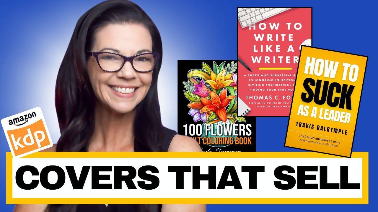
Most KDP creators obsess over page count, prompts, and keywords.
Meanwhile, their cover is quietly sabotaging every click.
If your book isn’t getting clicks, it’s usually not your idea. It’s your packaging.
That might sound harsh. But it’s fixable.
Let’s break down what actually makes a bestselling cover for low and medium content books: planners, journals, coloring books, workbooks, and more. If your goal is page one placement and consistent sales, your cover has to look like it belongs there.
1. Clear Target Audience in Two Seconds
Within two seconds, I should know who your book is for.
Not something clever. Not something poetic. Clear.
Examples:
-
Teacher Planner
-
Gratitude Journal for Busy Moms
-
Bold and Easy Coloring Book for Seniors
If your audience is not obvious, your cover blends into the sea of generic books.
Specific sells.
Example: Teacher Planner
When you type “teacher planner” into Amazon, the top results are simple and traditional:
-
Apples
-
Pencils
-
Blackboard themes
-
Clear typography
Even if some of those are spiral-bound and professionally printed, you can still create covers in that style. What matters is clarity and alignment with buyer expectations.
Now compare that to a cover where the title is hard to read at thumbnail size. If I have to zoom in to understand what it says, it’s already losing.
Clarity beats cleverness.
2. Big, Readable Titles Win Every Time
Your book cover lives as a tiny rectangle on Amazon.
If I cannot read it on my phone, it will not convert.
You want:
-
High contrast
-
Simple fonts
-
One to two font styles max
-
Clear hierarchy of text
Readability beats decoration.
A Real Example From My Own Book
I published a book called Unicorns, Castles, and Butterflies.
The interior is strong. I stand by it.
But the title on the cover? Too small.
When viewed close up, it looks fine. But as a thumbnail, the text disappears. That means lost clicks.
What should I have done?
-
Made the title larger
-
Added stronger contrast
-
Possibly included a white cloud or solid background behind the title
-
Clarified the audience with “Maze Coloring Book for Kids Ages 6–8”
The fix isn’t complicated. It’s about visibility.
3. Show the Benefit, Not Just the Category
Low and medium content books must show transformation.
Not just:
Planner
But:
Productivity Planner
Organize Your Week in 15 Minutes a Day
Not just:
Coloring Book
But:
Stress Relief Coloring Book
People buy outcomes.
If your cover doesn’t hint at a result, it becomes forgettable.
One of My Cover Mistakes
I created a book called Innovate and Elevate: Creative Entrepreneur Toolkit.
The phrase “Innovate and Elevate” sounds nice. I love it.
But what does it mean at a glance?
It’s too abstract.
Instead, I should have emphasized:
Creative Entrepreneur Toolkit
Then used “Innovate and Elevate Your Business” as a supporting subtitle.
The main promise must be clear.
4. Avoid “Cutesy” Titles That Confuse Buyers
Another example from me:
Monetize Your Passion: A Guide to Earning from Your Small YouTube Channel.
“Monetize Your Passion” feels meaningful.
But on Amazon, buyers are scanning. They are not decoding metaphors.
What should it have said?
Make Money on Your Small YouTube Channel
Clear. Direct. Search-friendly.
And the image? It should clearly relate to YouTube, not require interpretation.
If someone has to think too hard, they move on.
5. Clean, Professional Layout Matters More Than You Think
This is where most new creators lose.
Watch for:
-
Text too close to edges
-
Cluttered graphics
-
Too many colors
-
No spacing
-
Random element placement
White space makes a book feel premium.
Crowding makes it feel homemade.
Less noise = more trust.
6. Match the Niche — Then Upgrade It
Go to page one of your category.
Your cover should:
-
Match the style buyers expect
-
Use similar visual language
-
Feel like it belongs
-
Add one small upgrade
You do not want to be wildly different.
You want to be the strongest version of what is already selling.
Example: My Fantasy Novel
I once hired a designer to create a fantasy cover for me.
Sword. Dramatic lighting. Bold title.
When I searched the genre, it blended seamlessly with other fantasy novels. Same tone. Same structure. Same expectations.
It fit the niche.
That’s the goal.
Example: My Coffee Tasting Log
I created a coffee tasting log book called The Coffee Snob.
Simple coffee cup. Bold title. Clean layout.
When I searched coffee log books, the visual language matched:
-
Coffee imagery
-
Clear title
-
Minimal clutter
Even though the niche itself was small, the cover aligned perfectly with the category.
A Quick Cover Checklist
Before you publish, ask yourself:
-
Can someone instantly tell who this book is for?
-
Can the title be read clearly on a phone?
-
Is the benefit obvious?
-
Does it match the visual style of page one competitors?
-
Is there enough white space?
-
Does it feel premium, not crowded?
If the answer to any of those is no, revise before you publish.
Final Thought
Your interior can be excellent.
Your prompts can be brilliant.
Your keywords can be optimized.
But if your cover doesn’t earn the click, none of that matters.
Your cover is not decoration.
It’s your sales engine.
And when you treat it that way, everything else you’re doing on KDP starts working harder for you.